Sunday 24 July 2011

Remembering Lucien Freud


One of the greatest portrait painters of the 20th century Lucien Freud has died aged 88. Famous for his nudes and his true to life portraits he became know at age just 21 when he had his first one man show in 1947. Lucien Freud was well know through out the art world as I was growing up throughout my college years Lucien Freud's work was studied many times and became the subject of much art banter visited his collections in London galleries and practically grew up with him in my head he was in fact a legend of 20th century British art.

Lucien inspired a lot of our figurative work. The study was sometimes based on his grandfather Sigmund freud. Have you ever tried creative writing? Its where you take some paper and write and write without stopping. It was way back during my early years I was 18 at the time. The task for that day was explore the drawings that were created from a creative writing lesson. Im sure that the Dada movement and the surrealists were inspired by the late sigmund freud. His death marks the end of a part of my life and the end of an era. The very last of the greatest 20th century painters

He will forever be remembered as an art legend. RIP Lucien

Prep ideas for a new painting project

13th April 2011

This project did not work out and i've since abandoned it to start a new one. I got half way through this project and just hated it I could not continue with a project when my heart is not in it I need to like the project I am doing but never mind I have started a new project called ''Goldfish Bowl'' which I have posted on a new page.


Great artist usually always start a good painting or work of art with prep work done in a sketch book. Prep work doesn't have to be great but it helps towards making a great piece of work. The prep work for a good painting usually takes months. This idea came from the old masters. Usually renaissance paintings were religious so I looked at work by Albrecht durer ''The four horsemen of the apocalypse'' (left) and an idea I had when I saw the gulf oil spill on TV came to mind. I thought doesn't that sound like something from the book of revelations ''The sea will turn red and everything in it will die, and there was a fire on the sea''. I'm not a very religious person but it started the idea going. At first I though what a depressing idea but then it came into being an idea for a six foot religious work of art im now thinking I could research old masters and use them to help influence the idea for this painting I thought I could research angels too and incorporate them into the composition in the painting.


At first I made a quick line sketch just to figure out how the        composition may look, then improved the idea as I went along, this is how artists work.


This one ( left ) I was trying the idea out again this time in more detail using coloured pencil. The the white horse represents the Antichrist, the green one sickness, black famine and red war. I like drawing animals so although this project sounds depressing its really quite interesting to draw the horses in great detail.


This was trying the idea out again using watercolour, still trying to improve the composition, I changed the horses positions of movement as i thought it might also be a good idea to add more movement into the painting. Whether this idea turns out to be an idea for a full working project or just an idea for one painting I've yet to discover.


Tuesday 24 May 2011

Stuckism and goldfish bowl

A few days ago I met a bunch of artists called the stuckists. The stuckists are all painters, they believe that painting is the best way of expressing contemporary issues so do I so I joined them.

Monday 16 May 2011

Colour Charts


Ok lets kick some artistic peoples butts. Lets take four of my very favourite paintings and picks out all the colours in all four paintings paint all the colours on a colour chart and see what colours we can find to use in my painting. Wow this should be very interesting indeed. :o) This painting is juicy girls under trees, look at all the colours in this. Of course you have to know how to use each colour properly you cant just stick any colour anywhere eg blue for shadow, yellow and cream for highlights.

From top to middle to bottom girls under trees august mak, Emile nolde white tree trunks, and Paul Signac Papal palace avignon. looking at all these colours i feel ill its psychedelic LOL XoD HAha ok lets just look at three lol

Always loved this not because of the style again because of his use of colour Paul Signac Papal palace Avignon if that's the correct spelling unbelievable use of colour.

That's enough ive given myself enough here. You might be thinking ''why bright colours, with such a negative subject matter?'' Well autism is considered to be on a ''spectrum'' when we think of spectrum we think of rainbow its almost sickly maybe over powering but so is living on the autistic spectrum. Ok really am going night night people X

Saturday 14 May 2011

First class honours

 A SPIRIT LEVEL 16th may 2011
With me having astigmatism in my eyes sometimes straight lines appear slanted to me even when I have my corrective lenses in this is becoming a technical problem for me in my paintings. I have decided to solve this problem tomorrow by buying a spirit level first thing in the morning i am off to B&Q to buy the spirit level.


Today the spirit level I didn't need to use the only on the top line on the left hand side of the roof, but my other lines were exactly in the centre this surprised me a lot. I said I wasn't going to post any more images, but the phone will have to do for now ill show you the perspective lines.


I was given first class honours because I was consistent all the way through my degree. Here are some of my grades. 

.For ART271 Fine art contemporary practice I was given 70-100% overall grade 72% 

. Module assessment report I was given a whopping 85 in 2007

. For ART246 Fine Art Methodology i gained the full 40 credits and was given overall grade 73%

. For ART346 in my last year Fine art presentation module 001 coursework I was given 75%

. For DWG101 in my first year  I was given the overall grade 63%

. ART190 I was graded 69% Can I ask you a question (''why am I still sitting here?'') I cannot believe with these grades that somebody from the art world has not found me already. What more do I have to achieve before the R.A will accept me.


The art market favours those that are ''avant garde and modern'' Its not that I don't like modern art its just seems if a person work is bought by sacchii then it is seen as talented and is but if one is a painter one it seems is left behind. Surely anybody not just I that's gets a grade like 85 at degree level deserves a chance. but the art crits and art market do not accept new people very often. A person with a grade like 85 deserves at least a chance to go to the RA and be be recognised by the art world 85 is brilliant. A person deserves it with a grade like that its clear has potential to do well there. 


I am just hoping that one day somebody from the art world will read this and at least have a chat with me that is all I can hope for.

Monets Gardens Giverny

Monet
Monets paintings are very detailed aren't they. I kind of know how he did it though and if I was in the correct frame of mind and spent a long time building up the layers of colour I honestly think I could make a painting like that but it would take me a long time. I mean how many layers of colour are on that painting on the first darker layer more than five, Its like the darkest green maybe even prussian blue then about seven shades of green, six shades of yellow, then another later of about six different shades of darker green like viridian hue plus about another seven shades of yellow and dots of red using different hues lol it would take me ages to paint like that. Wow yep I agree one would need an awful lot of paint, one can tell he had a lot of money I couldn't afford to paint like that one would go through at least ten tubes of paint in a day making that.

 You know what I think he's done right he's just taken every different shade of green know to man, viridian hue, and sap green, bottle green hes taken all the greens know to an artist then tinted them all with yellow and other greens to make another 20 shades of green, then hes done it with all the other colours too LOL hes probably ended up with a full colour chart of shades of the same colours like 20 shades of yellow and 20 shades of green. I mean think about it how many different shades of green can one tube of sap green make the answer is a lot. Hes probably mixed pure unmixed greens together too to make more greens LOL mad. Van Gogh had 20 different shades of yellow in his studio. Monet has probably had god knows how many shades of the same colour, I mean with one tube of green one can make 20 shades of the same colour at varying hues and shades, add more shades of green from different tubes and tint the shades with blue and yellow one would end up with maybe 40 shades of green LOL that is a crazy amount of green wow my eyes are seeing green just thinking about it. If one adds blue to green one ends up with a darker shade of green add varying amounts of yellow to green one would have different shades of the same colour the possibilities are endless ive no idea how many tubes of paint he used to make that.

In fact he probably already had a colour chart made before he started the painting that is in the museum d,orsay Paris on the front of that book. I also do that (make colour charts) in fact im making one for the Goldfish Painting he probably made his colour chart before hand or he already had one made making a colour chart is a very organised and sensible thing to do. He's an expressionist painter they studied the effects of light and colour. The sensible thing for me to do would be for me to research into Itton colour theory book refresh my memory on colour theory before I start my own colour chart. Ill be working with pure pigment i wont be mixing red or blue to make violet or red and yellow to make orange ill be using pure pigment for that with artist quality paint. Ill already have shades of artist quality green too in tubs i wont be mixing the colours except to make them lighter by tinting them or making the colours darker by adding a vibrant blue maybe a brilliant red or crimson I want all my colours vibrant not muddied.


Monets working from dark to light im actually doing the opposite I think im working from light to dark because my under painting is yellow ive honestly no idea why I started a yellow under painting, I think it was because of the sky so I just made the whole under painting yellow without thinking too much about it ''sunset coloured'' under painting I could have made the under painting red if I had wanted then it would have been better but im admitting that now but light to dark might be still ok notice how ive added orange over the yellow and not green to start with build up the colours slowly.

Monday 9 May 2011

Artists Varnish

I was saying I wont be posting any-more images until I get a digital camera, because I cant seem to hold the phone straight and its bad quality images taking pictures and uploading them from a mobile phone.


Hello everybody hope you all had a nice day. Its been a great day at the art studio with my painting. My very pleased with how the painting is progressing its looking amazing. There was only one way to solve the annoying brightening problem its called ''VARNISH'' lol :oD #

When you are making a painting some people are tempted to put varnish all over the painting I would say dont do that. One should use varnish only in certain areas. The sky looks amazing that ive painted the violet areas with varnish and ive drawn most of the building in the background onto the canvas. Unfortunately I could not take a picture today because my phone ran out of batteries, i dont have enough money to buy a digital camera at the moment so em im using mobile uploads I know not great. I will show you how the final piece is looking tomorrow then you can post me your thoughts. I'd like to hear people views on how I can improve it and what you think of it. :o) I bought this exact same brand today, reeves aren't a bad brand really there stuff is ok. It does the job and its well cheap priced it i bet if id gone to the city art store it   would have been about £10 for some varnish it maybe isn't as shiny but its ok :)

Sunday 8 May 2011

'Goldfish Bowl' The poem that inspired latest project


Here is the poem that inspired my latest project ''Goldfish bowl" a big thanks to John Makin for letting me post his poem on here, great poem. The poem describes his view on how it feels living in the world of ''autism''.


"Goldfish Bowl"

Like a goldfish in a bowl
Swimming round and round
Seeing everything outside
And hearing every sound

And yet that world is so remote
The world for which one aches
Beyond the boundary of the bowl
The glass that separates

Experience has etched the glass
Has coloured all we see
Distorting what is in the past
And what we think might be

It leaves a scratch, a stain, a smear
It darkens what was light
It clouds what once we thought was clear
Makes dull what once was bright

And what it does is permanent
We can't wipe it away
We cannot make it as it was
What's changed is here to stay

Another way may yet be found
To view what is outside
A distant scene upon a screen
A camera can provide

For we may have a perfect view
On CCTV screen
Where we can see each tender hue
Of lovely vibrant green

But that view is never true
It cannot really be
For what is real is what we feel
Not what we only see

Does the rain there really fall?
The sun there really shine?
If I can't touch the things I feel
Are those feelings mine?

How can we know if it exists
Or is it in a dream
When we can never taste or touch
Or feel what we have seen

How can we know the world outside
With which we're out of phase
From which we hear constant complaint
And not a word of praise

The view we have is so remote
As seen through others eyes
We can only try and cope
But is it telling lies?

How can we know what is out there
Outside this lifeless cell
Beyond the walls so stark and bare
This prison where we dwell.

paintings

Here are a few more of my paintings this one on your right was made during my early years at university i was about 19 when I painted museum and winter gardens its mixed media on cartridge paper its made from oil pastels, acrylic paint pva glue and toilet roll surprisingly.


This painting titled ''Escape From The Witch lol'' was made october 2oo8 while working on paintings based on surrealism and realism while I was writing a book i decided to try to paint the chapters from the story its not illustration however as with illustration you must follow the story with painting you can let your imagination decided what goes into the artwork the story only provided a base for the idea this paintings along with the three paintings below were part of a story book series for my final year degree show exhibition.

This painting titled The Rescue is still quite early on in the story is where the father finds the family so they go on a hunt to witches castle looking for the dead book.


Im not sure where this painting came in relation to the story. Painting is not illustration it doesn't have to follow the story with painting imagination can take take you anywhere the story only provided a simple foundation for ideas to grown but with illustration the story line must be followed that is why i like painting so much.


This painting titled "The Barn" helped me improve my painting style greatly. The idea for this painting came from a very early chapter in the story this is just before the little girls adventure with the horse begins, she is playing in the barn with the animals. The 
painting provides a lovely contrast to the earlier darker paintings because of the rich yellow background. The contrast between them I think made an interesting combination for my degree show. I think I learnt to paint on a much bigger scale using bigger brushes it made the paint look much fresher and more vibrant than my previous paintings. I also 


learnt about the effect light and tone can have on a painting. It was made at first as prep work rather like a collage. I chose two found images and glued them onto a background I thought would be appropriate for the scene in the painting. I then took the idea into paint using a 5ft x 4ft
canvas.


The butterflies came from my interest in the American wildlife while in North Carolina on a business trip I made sketches done in a sketch book of the butterflies. I was missing England so incorporated the two countries into one painting when I returned home with the sketches id done.


I then started to paint all different wildlife which turned into a simple
 wildlifeproject of woods, flowers and the sea taken from found images
of wildlife from all over the globe. This was made using moulding artists clay to create tree like texture again the red squirrel came from the idea from studying endangered British wildlife.


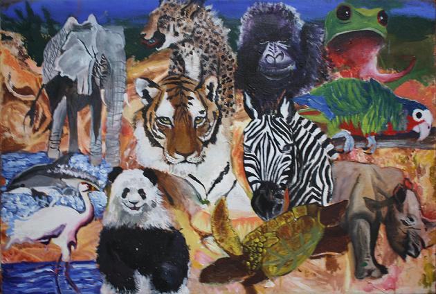
This painting done of a picture of the great barrier reef in Australia I found particularly interesting because i used a type of artists clay i covered the whole canvas with it let it dry then painted over it to create texture it was a great effect the "bumps" made the whole this look as though the painting was rippling like the sea i used
thicker layers of the clay in the foreground and thinner layers in the background mid ground mid layers ans so on.


I then went on to sketch ideas in my sketch book of
endangered animals until i added all the animals id studied together and created a kind of animal wallpaper. the muddy background in this painting was intended to be the bare patches of the Amazon where the trees have been cut down where there are nothing but bare patches of muddy soil left.


Again these two paintings are of America. While I was in North Carolina i took a pay and go phone card with an eagle on it to the print room I blew up a copy and then proceeded to the north Carolina zoo to study the bald eagles I used the phone card and my observational sketches to produce these two paintings when I arrived back to England the painting (right and below)


This painting came from the American pay and go phone card I mentioned earlier in the above text its made with oil colour instead of my usual Acrylic medium.

This one below right is titled "The lonely parrot" was made from cheap poster paint then scraped off to reveal colour underneath it was supposed to be an experimental preparation piece ready for the final moderator. The colours represent the bare Amazon rainforest where there are no trees left with the lonely parrot representing a dying endangered breed sitting on a branch above the bare Amazon forest.